
Making products easier to find and simpler to buy
A consumer tech store where shoppers were browsing but not finishing. We reworked how products are found, presented and bought, and built social creative to match.
- Client
- Thunderbolt Tech
- Sector
- Charging and consumer tech
- Market
- United Kingdom
- Platform
- Shopify

The commercial challenge
Chargers and cables look alike until you read the specification. Shoppers struggled to find the right product, compare options and get through checkout without second guessing their choice.
Where things started
A Shopify store with a solid product range and seasonal promotions, but navigation and product presentation that made similar items hard to tell apart.
Our approach
- 1
Lead with the number that decides it
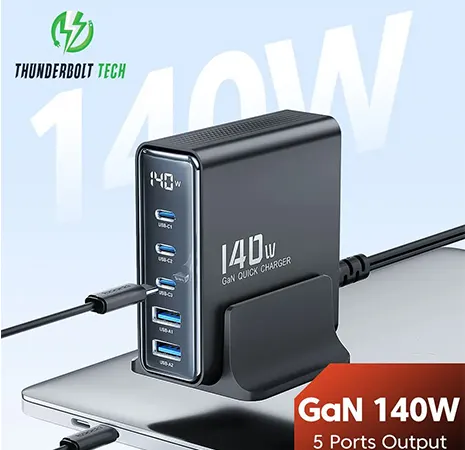
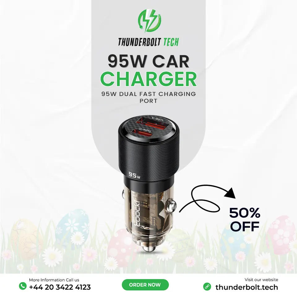
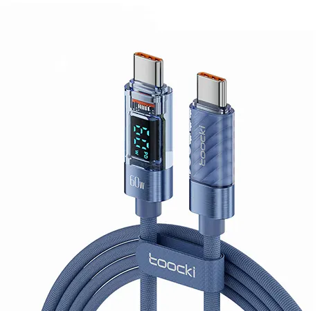
For a charger, wattage and port count are the buying decision. We made them the first thing a shopper sees on the creative and on the product page.
- 2
Fewer paths, clearer paths
Collections were grouped the way shoppers think, by what they want to charge and where, rather than by internal product codes.
- 3
Remove doubt at checkout
We reviewed each step from cart to payment for anything that made a shopper pause, and simplified it.
Selected visuals

What changed
Products now read clearly at a glance, both in the feed and on the store, and the route from browsing to paying has fewer steps that invite hesitation.
We only publish figures we can support with data and the client's permission.